Less is More: What Presenters Can Learn from TV Graphics
If you present regularly but want to get better, you can learn a lot from TV news. When you watch the news, notice how presenters use graphics. The visuals have just a handful of words, one chart or image. Clean design, few words. The rest is left to the presenter — to explain, to interpret, to make sense of what the viewer is seeing.
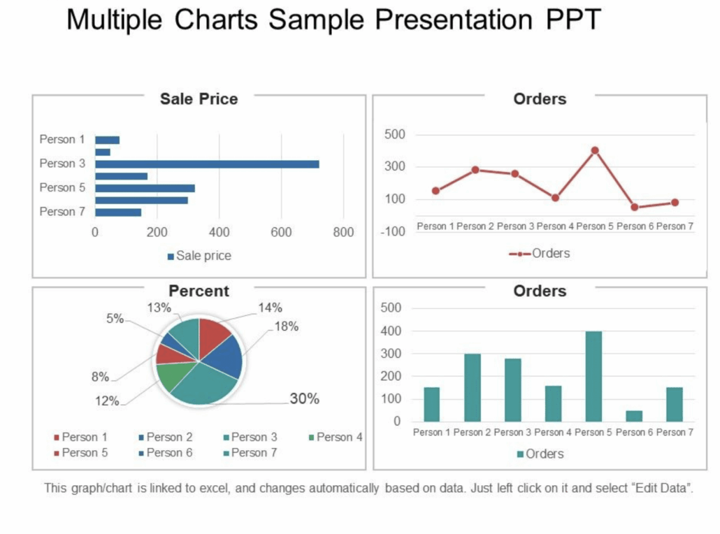
When we are coaching presenters, it is something that many or even most get wrong. In corporate presentations, people often try to make the slide do all the talking. The result? Slides crammed with text, complex charts that only the author can read, or bullet points that compete with the speaker’s voice. Having coached many senior medics, for example (KOLs or Key Opinion Leaders in particular), they seem to delight in putting four charts on one slide. This sample, offered as a template from Slidetem.net, is, in my view, a perfect example of how not to do it.
The problem is simple: when the audience is reading, they’re not listening. Their brains can’t do both at once. So, if your slide is full of words, you’ve effectively told your audience, “Don’t listen to me — puzzle this lot out instead.”
Television journalists understand something different. They use graphics to reinforce the message, not deliver it. Sky News recently gave us a great example: the graphic shows a series of simple lines charting changes in disposable income, while journalist Gurpreet Narwan provides the meaning — why it matters, what’s changed, and how it compares.
A few practical ideas:
- Strip back every slide to its essence. For further reading I recommend Garr Reynolds who writes books and blogs about this.
- Stick to one idea per slide, and one graphic or chart. If you want people to compare charts, introduce them separately, explain, then show them side by side.
- Remove words. The more words on the slide, the more distracting — and the more you’ll be tempted to read them yourself.
- When you put up a slide, it can help to give the audience time to absorb the details, but you might also briefly explain the basics, something like: “The X axis is time in 24-hour increments, the Y axis is average calories consumed.”
- Use modern tools to highlight or animate as you speak — as in the Sky News example.
The test is simple: if someone could understand your presentation without you in the room, you’ve gone too far.
Good slides make the audience look at you, not away from you. They prompt curiosity, not silence. And when you strike that balance — less information, more explanation — you move from being a presenter with slides to being a communicator with impact.
If you or your team need help to be a better presenter, call us on tel: 7099 2212 or email equiries@themediacoach.co.uk.
- A Behind-the-Scenes TV Cheat… and Why It Works - November 26, 2025
- What Should I Do With My Hands? - November 19, 2025
- A Jar of Marbles and the Power of a Simple Story - November 12, 2025


I’d refer everyone to search YouTube for Don McMillan Powerpoint. A very funny stand up comedian who has built a career on extracting humour from powerpoint fails.