 https://themediacoach.co.uk/wp-content/uploads/2024/10/Feature.png
210
300
Eric Dixon
https://themediacoach.co.uk/wp-content/uploads/2016/04/the-media-coach-logo-300x137.png
Eric Dixon2024-10-29 12:17:182025-02-18 08:56:24Introducing the ‘Act Out’:
https://themediacoach.co.uk/wp-content/uploads/2024/10/Feature.png
210
300
Eric Dixon
https://themediacoach.co.uk/wp-content/uploads/2016/04/the-media-coach-logo-300x137.png
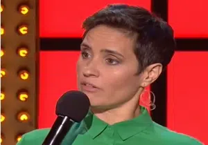
Eric Dixon2024-10-29 12:17:182025-02-18 08:56:24Introducing the ‘Act Out’:At The Media Coach we are so passionate about communications training that we think about it constantly! We regularly monitor the news agenda to examine how other people and businesses communicate with the media. This includes their messaging to their body language and delivery style. Our communications trainers regularly contribute to The Media Coach Blog which you can read below.
https://themediacoach.co.uk/wp-content/uploads/2024/10/Feature.png
210
300
Eric Dixon
https://themediacoach.co.uk/wp-content/uploads/2016/04/the-media-coach-logo-300x137.png
Eric Dixon2024-10-29 12:17:182025-02-18 08:56:24Introducing the ‘Act Out’: https://themediacoach.co.uk/wp-content/uploads/2024/07/feature.png
210
300
Eric Dixon
https://themediacoach.co.uk/wp-content/uploads/2016/04/the-media-coach-logo-300x137.png
Eric Dixon2024-07-02 10:12:082024-07-02 10:12:08Politics as Entertainment
https://themediacoach.co.uk/wp-content/uploads/2024/07/feature.png
210
300
Eric Dixon
https://themediacoach.co.uk/wp-content/uploads/2016/04/the-media-coach-logo-300x137.png
Eric Dixon2024-07-02 10:12:082024-07-02 10:12:08Politics as Entertainment https://themediacoach.co.uk/wp-content/uploads/2024/05/Feature.png
210
300
Lindsay Williams
https://themediacoach.co.uk/wp-content/uploads/2016/04/the-media-coach-logo-300x137.png
Lindsay Williams2024-05-21 09:37:372025-02-18 09:22:11Media Savvy Operators Know How to Place a Quote
https://themediacoach.co.uk/wp-content/uploads/2024/05/Feature.png
210
300
Lindsay Williams
https://themediacoach.co.uk/wp-content/uploads/2016/04/the-media-coach-logo-300x137.png
Lindsay Williams2024-05-21 09:37:372025-02-18 09:22:11Media Savvy Operators Know How to Place a Quote https://themediacoach.co.uk/wp-content/uploads/2024/05/magic_of_performance-Feature.png
210
300
Lindsay Williams
https://themediacoach.co.uk/wp-content/uploads/2016/04/the-media-coach-logo-300x137.png
Lindsay Williams2024-05-14 08:57:342024-05-14 08:57:34The Magic of Performance
https://themediacoach.co.uk/wp-content/uploads/2024/05/magic_of_performance-Feature.png
210
300
Lindsay Williams
https://themediacoach.co.uk/wp-content/uploads/2016/04/the-media-coach-logo-300x137.png
Lindsay Williams2024-05-14 08:57:342024-05-14 08:57:34The Magic of Performance https://themediacoach.co.uk/wp-content/uploads/2024/05/Feature.jpg
210
300
Lindsay Williams
https://themediacoach.co.uk/wp-content/uploads/2016/04/the-media-coach-logo-300x137.png
Lindsay Williams2024-05-08 09:38:042025-02-18 08:55:21Our Top Tips:
https://themediacoach.co.uk/wp-content/uploads/2024/05/Feature.jpg
210
300
Lindsay Williams
https://themediacoach.co.uk/wp-content/uploads/2016/04/the-media-coach-logo-300x137.png
Lindsay Williams2024-05-08 09:38:042025-02-18 08:55:21Our Top Tips: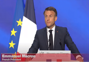 https://themediacoach.co.uk/wp-content/uploads/2024/04/Emmanuel-Macron-Feature.png
210
300
Lindsay Williams
https://themediacoach.co.uk/wp-content/uploads/2016/04/the-media-coach-logo-300x137.png
Lindsay Williams2024-04-30 08:34:522025-02-18 09:32:41Talk of War: Worried Leaders Walk a Tightrope
https://themediacoach.co.uk/wp-content/uploads/2024/04/Emmanuel-Macron-Feature.png
210
300
Lindsay Williams
https://themediacoach.co.uk/wp-content/uploads/2016/04/the-media-coach-logo-300x137.png
Lindsay Williams2024-04-30 08:34:522025-02-18 09:32:41Talk of War: Worried Leaders Walk a Tightrope https://themediacoach.co.uk/wp-content/uploads/2024/04/Feature.jpg
210
300
Eric Dixon
https://themediacoach.co.uk/wp-content/uploads/2016/04/the-media-coach-logo-300x137.png
Eric Dixon2024-04-23 09:11:572024-04-23 09:11:57All Presenters Need a Critical Friend
https://themediacoach.co.uk/wp-content/uploads/2024/04/Feature.jpg
210
300
Eric Dixon
https://themediacoach.co.uk/wp-content/uploads/2016/04/the-media-coach-logo-300x137.png
Eric Dixon2024-04-23 09:11:572024-04-23 09:11:57All Presenters Need a Critical Friend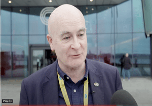 https://themediacoach.co.uk/wp-content/uploads/2024/04/Feature.png
210
300
Lindsay Williams
https://themediacoach.co.uk/wp-content/uploads/2016/04/the-media-coach-logo-300x137.png
Lindsay Williams2024-04-16 08:14:592025-02-18 09:33:47Why Mick Lynch is Right to be Wary of Pre-recorded Interviews
https://themediacoach.co.uk/wp-content/uploads/2024/04/Feature.png
210
300
Lindsay Williams
https://themediacoach.co.uk/wp-content/uploads/2016/04/the-media-coach-logo-300x137.png
Lindsay Williams2024-04-16 08:14:592025-02-18 09:33:47Why Mick Lynch is Right to be Wary of Pre-recorded Interviews